Appointment Scheduling for the U.S. Department of Veterans Affairs
The dysfunction at the VA is legendary, unfortunately. In 2018, Cerner signed a $16 billion contract to help fix many of these widespread problems. Included among them were issues with their appointment scheduling platform. It was a hodgepodge of outdated technology with interoperability issues. Veterans struggled to get doctor visits scheduled without headaches. The VA is insanely complex and this project had quite a few unique challenges to overcome.
Role
Due to the complexity and scope of this project, three designers and one design researcher were heavily involved with this project. I was tasked with creating the initial vision for the mobile experience that would serve as a foundation for formative usability testing along with adapting it to desktop.
Challenges
The key ask of our team was to architect a smart scheduling experience that could intuitively triage/filter appointment requests to the precise medical specialty. A patient trying to set up a CT scan and a patient with a bad cold need to be routed to completely different areas in a health system. We soon realized this could be a daunting task because we did not agree among ourselves on what the first layer of information capture should be.
To try and create some logical buckets of common appointment types, I enlisted our design researcher to conduct a card sort to see if there were natural appointment buckets that participants would gravitate toward. The study included about 50 people from the general population with about half with experience using online medical appointment scheduling and the other half at least expressing interest in doing so. The key problems we identified from the card sort included:
Participants created a wide range of categories for the list of 30 common health problems and/or symptoms.
When similar categories were created by participants, there was often a lack of agreement of what items belonged in the categories.
While the amount of created categories were diverse, most participants grouped appointments using one of the following strategies:
Expected service or treatment to be received
Urgency
Symptoms or affected body part(s)
Medical specialty
Based on these results, we started to collectively map out the possible branches we thought might be beneficial to test. For the initial iteration, we decided the first important step in the flow would be to have the user select one of the following visit types:
Urgent care
Annual physical
Immunization or lab test
Condition management
See my doctor

Constructing the interface
Once we had a view of all our needed content, I started roughing out UI patterns. To get inspiration, I reviewed all kinds of different scheduling apps across different industries including healthcare, auto repair, airlines, hospitality, and enterprise reservation software. Next, I started sketching out ideas in my notebook as a jumping off point. (Unfortunately, I can’t find any of the sketches due to a COVID-related desk clean out.) Once I had a vague idea of where to take things through sketching, I moved on to creating some higher fidelity UI directly in Sketch.
I’m a huge proponent of quick iteration and feedback. Bill Buxton’s Sketching User Experiences was a profoundly influential book on my design career. A key takeaway from it was that the best way to arrive at the best design is to quickly experiment with as many possible variations of a design you can. For example, you can either spend 100 hours creating a single masterpiece or spend 1 hour each creating 100 different variations of the same design. His argument––backed up by my own experience––is that the latter will achieve a much better result.
Below you can see how I explore many different directions just to arrive at one screen. As a general rule, I try to have at least several iterations of a design before using it. As complexity increases, so should the amount iterations you create. Modern design tools make this extremely fast and effective. Additionally, I did not create any UI components from scratch because an existing UI/component library was in place.


At this stage, another challenge that surfaced for the mobile experience was how to strike the right balance between showing enough available appointment time slots per provider to be helpful and not including too many as to balloon the vertical height of the list, which would impact the amount of scrolling you’d have to do to find an appointment. This was solved by only showing the first three available appointments face up and putting additional appointment time slots in a collapsed menu as shown below.

Prototype
Once all the screens were more or less complete, the next task was putting together a prototype that we could start usability testing to validate our concepts. The effort to wire up an InVision prototype with six different workflow tests was a collaborative effort. The immunization appointment type workflow is shown below.

Results
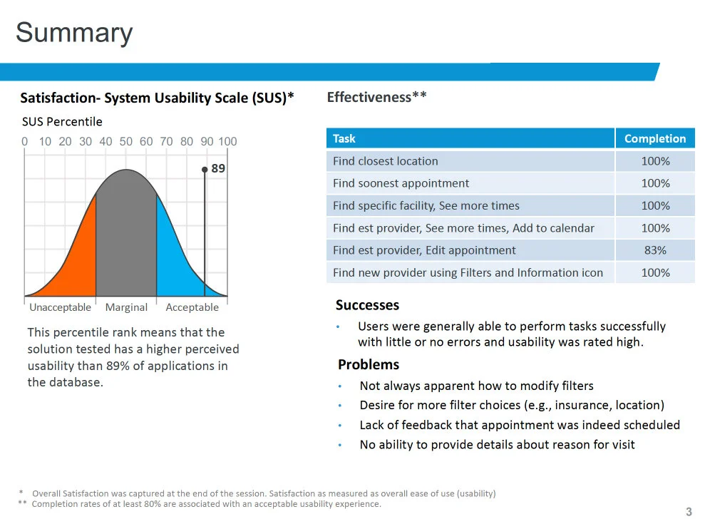
The initial round of usability testing on the designs went much better than anticipated. Task completion rates were 100% with the exception of editing an appointment at 83%. And our SUS came in at the 89th percentile, which is well above most experiences. These results didn’t mean we were finished, however. Due to the very large scope of this project, we went through multiple rounds of designing and testing to refine our ideas further. Having a good foundation on mobile made it much easier to figure out the desktop experience.
The design wasn’t without faults though. The biggest issues we uncovered were related to appointment filtering and scheduling feedback. The filter controls turned out to be too minimalistic and needed some extra affordances. It also wasn’t very clear to the user when they were actually finished with the appointment confirmation process. There was too little feedback that they had succeeded in creating the appointment. Little issues like these we fixed in subsequent updates to the design.
Rolling out anything at the VA is incredibly time consuming so it will be a few years until this is used widely by the entire veteran population, but it’s already in the hands of thousands of vets in several states. Helping vets get easier access to care is something I’m pretty proud of even if it’s just a small improvement in their lives.