Telehealth updates
Over the past few years, telemedicine has been surging. COVID rapidly accelerated its adoption and virtual doctor appointments are up big. Amidst this growing trend, I had the opportunity to make improvements to provider-facing telehealth tools that were experiencing slow adoption by providers and significantly increased utilization.
Role
I was the sole designer for this project and was backed up by a design researcher. I participated in our design research efforts as well as created the updated UI and a interactive prototype.
Challenge
Our telehealth business unit approached the UX team with a problem: our telehealth solutions for providers had lower than expected utilization and it wasn’t clear why.
Research
The design researcher and I visited a client health clinic in Indiana with the goal of understanding how providers used our partner teleheath technology to deliver patient care along with what needs and expectations might be if the tools were better integrated into Cerner’s clinical tools.
The doctors at this facility used our technology partner for telehealth visits but also for “virtual scribing,” where a nurse practitioner would be on the call as well to record doctor notes. We found these providers utilized both scheduled and unscheduled appointments––referred to as an on-demand appointment. Providers use on-demand appointments to fill any free appointment slots throughout the day to generate extra income that they would otherwise miss out on.
When we finally walked into one provider’s office and were shocked at what we saw.

Providers were using multiple devices to view the patient’s chart and the video conferencing app simultaneously. 😳
We learned the doctors would use one screen to view the video conference and another screen set up to look at the patient’s chart. Then another two set of screens were queued up to be ready for the next patient. This doctor was clearly stressed about the situation especially when he had issues with video connections.
It became evident through our questioning that we could significantly reduce the technical burden if we could integrate the conferencing and patient record experiences so this constant task switching wasn’t necessary.
For on-demand visits, we also uncovered that doctors wanted to pre-screen certain patients prior to accepting their visit. They stated that this was to see patients that matched with their area of medical expertise. If you’re a heart expert, you’re not likely to want to triage patients with a foot issue according to the providers.
We also wondered about potential bias problems here. Would doctors not want to meet with certain kinds of names, sexes, races, etc? Should we selectively hide names and faces if we were to have a patient queue?

We ultimately left in these identifying information because A) our code library didn’t have to be modified to use existing components and B) we didn’t have time to investigate these possible issues further.
Another avenue we wanted to explore was imbedding the video player directly into the chart. Unfortunately, this was a pretty big tech hurdle to overcome for the initial phase of work and we settled on a compromise of simply launching a new window with the video conference in it. That way the provider could easily Alt + Tab back and forth between the windows.

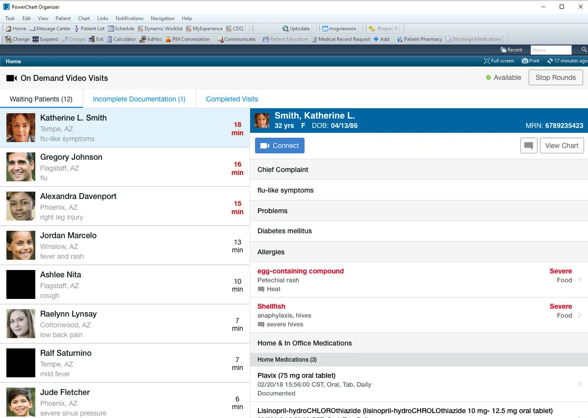
We also found during our questioning that to assess whether or not providers should see a particular patient in the on-demand queue, they needed quick access to the following patient information:
Chief complaint (this is doctor lingo for what’s wrong)
Current medications
Allergies
Major chronic problems
I included this information in the patient detail pane along with the ability to see the patient’s full chart.
Prototype

Results
We tested the prototype with 8 physicians and 3 nurse practitioners. The design scored a SUS of 86.25––which is well above averages for most software. Task success rates were very high, and the only area of minor struggle was brought about by my naming of the “Start Virtual Rounds” button. The physicians stated they didn’t consider these virtual appointments “rounds” in the healthcare sense of the word. They got a little hung up on this language, but it clearly didn’t match their mental model of what that term meant so it was changed to more of an available/not available status indicator.
Since our usability testing results were positive, the project team proceeded with development work. Unsurprisingly, client utilization increased by 36% within 6 months of implementation of my designs.